
The National Park Service: Pacific Northwest (NPS: PNW) is a comprehensive UX/UI overhaul of the existing National Park Service mobile app, undertaken as my senior capstone project at the University of Central Florida. It was selected for the Senior Web Design and Code Showcase. The focus was to improve functionality, usability, and engagement while emphasizing park discovery and conservation in the Pacific Northwest region.
The original National Park Service mobile app received complaints about poor map interaction, confusing navigation, and cumbersome task flows. As the app aims to cover all national parks across the United States, it presented an overwhelming amount of information, much of which wasn’t relevant in a given location or had to be downloaded. Additionally, the app did not adequately promote the National Park Service’s mission of education and conservation.
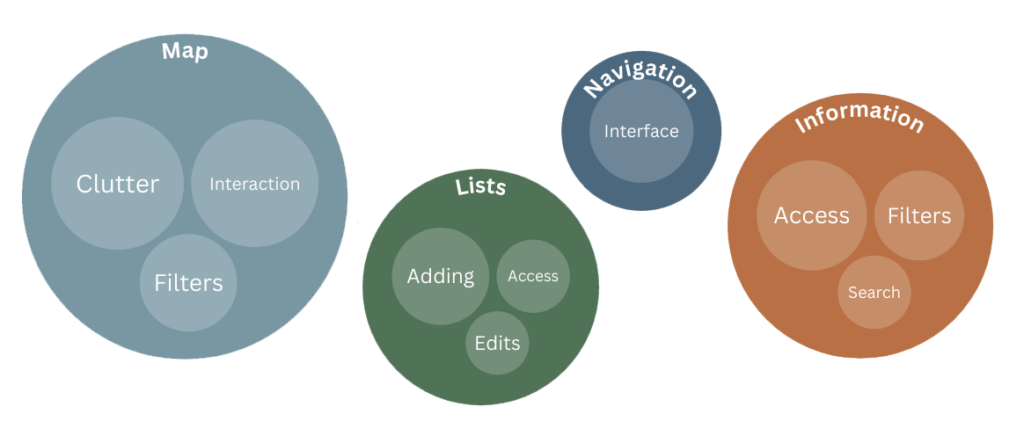
To address these issues, we designed solutions that focused on creating a streamlined, region-specific app. Our approach included:
Regional Focus
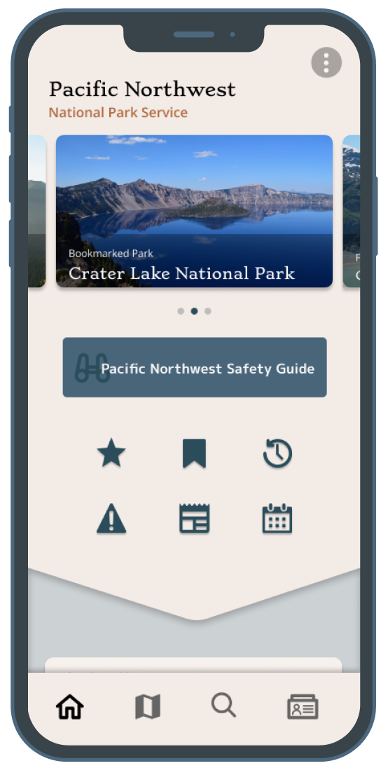
To avoid overwhelming users with nationwide information, we created a regional app focused on the Pacific Northwest. This approach allowed users to get relevant, localized content without the need for more in-app downloads or additional complexity.
Enhanced Map Interaction
The new regional map addressed user complaints about clutter and poor interaction. We designed it to be user-friendly, allowing users to zoom, pan, and interact with specific parks, providing a clear view of the Pacific Northwest’s national parks. We also designed intuitive filters to narrow down results.
Improved Navigation and Task Flows
The updated bottom navigation and redesigned menu made it easy to access key features like park discovery, active alerts, and user lists. Since park-specific screens were inconsistent with varying information layouts, we also created a standardized, clearer Park view to ensure a more cohesive user experience. Adding and removing parks from lists were simplified to buttons on the park screens.
Safety Guide and Digital Passport
The Safety Guide offers visitors important safety tips specific to the region, promoting a safe experience in national parks.
The Digital Passport encourages exploration by allowing users to collect virtual stamps from different parks in the region.
As the UX Designer, I focused on user-centered design by ensuring the new features and navigation systems were intuitive and accessible.
I was also one of the Full Stack Developers on the team and worked on implementing the UX and UI design.